American Express Gold Benefits
American Express Gold Benefits
We uplift the end-to-end digital benefit journeys across 10 global markets, across both desktop and mobile, to help Gold Cardmembers more easily find and enjoy their benefits.
- Client: Elena-Catalina
- Role: UI Designer
- Skills: UX/UI Design, UX Research, Interactive Prototype, Branding
- Tools: Sketch, Figma, & Photoshop
Project Overview
This project was all about rethinking how users connect with the perks of the Amex Gold card. Working closely with the design system, we created a responsive, end-to-end journey, from interactive benefit breakdowns to brand aligned components, ready for development and built to make rewards easy to explore.
Over the course of three months, I collaborated with Amex Brand Designer and our Heads of Product & Design to reimagine the Gold card benefits experience, designing and testing a responsive, user-friendly page that highlights perks, simplifies navigation, and brings the brand to life.
The Challenge
Through its online portal, Amex Travel offers Card Members access to unmatched travel experiences, including flights, hotels, cruises, car rentals, and more. Despite all this, Card Members were largely unaware of the breadth of its offerings, which were marketed as a disparate collection of travel benefits. Amex Travel needed to raise awareness and boost engagement, especially among their Gold Card Members.
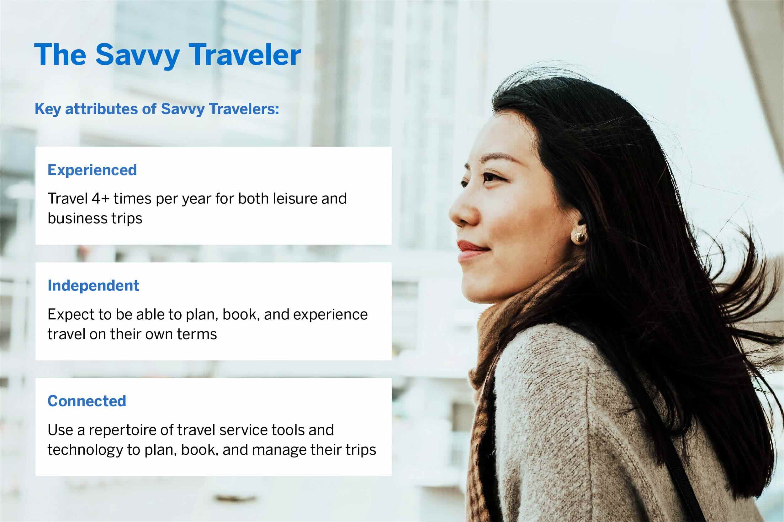
Target audience
We identified the primary target audience, The Savvy Traveler, people who live and work through travel.
Ideation
Through a series of collaborative workshops with Product and Design, we explored multiple solutions to address our core challenges. Our ideation process combined brainstorming sessions, competitor analysis, and user journey mapping to identify opportunities for a more engaging and accessible experience.
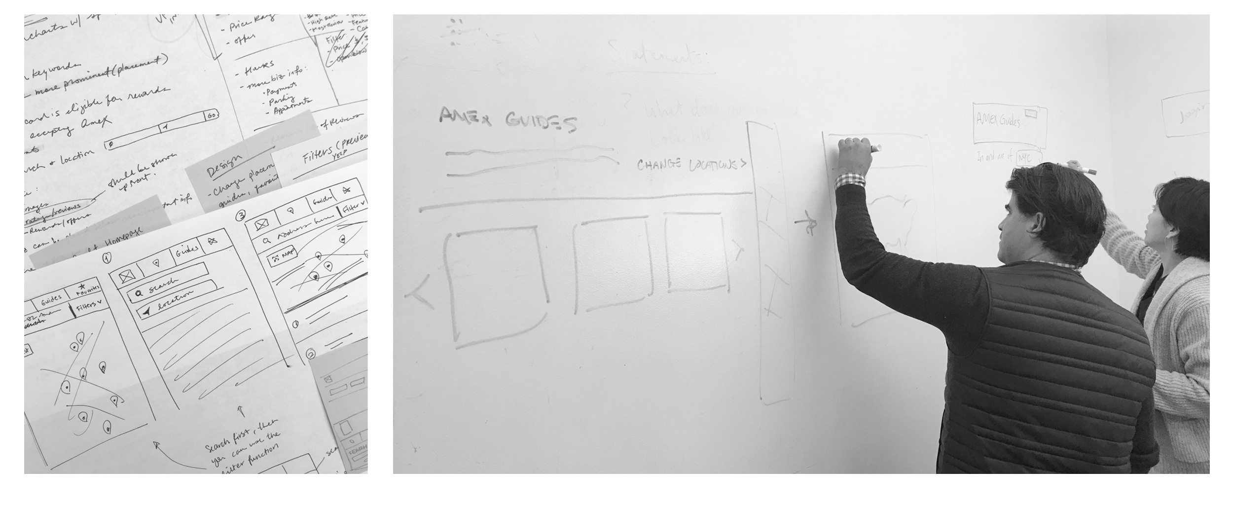
The user experience in mobile was crucial for this project as a significant percentage of the customers use the site while travelling. We worked on optimising user flows, defining the complete user experience, designing the new UI of the site and building an interactive prototype.
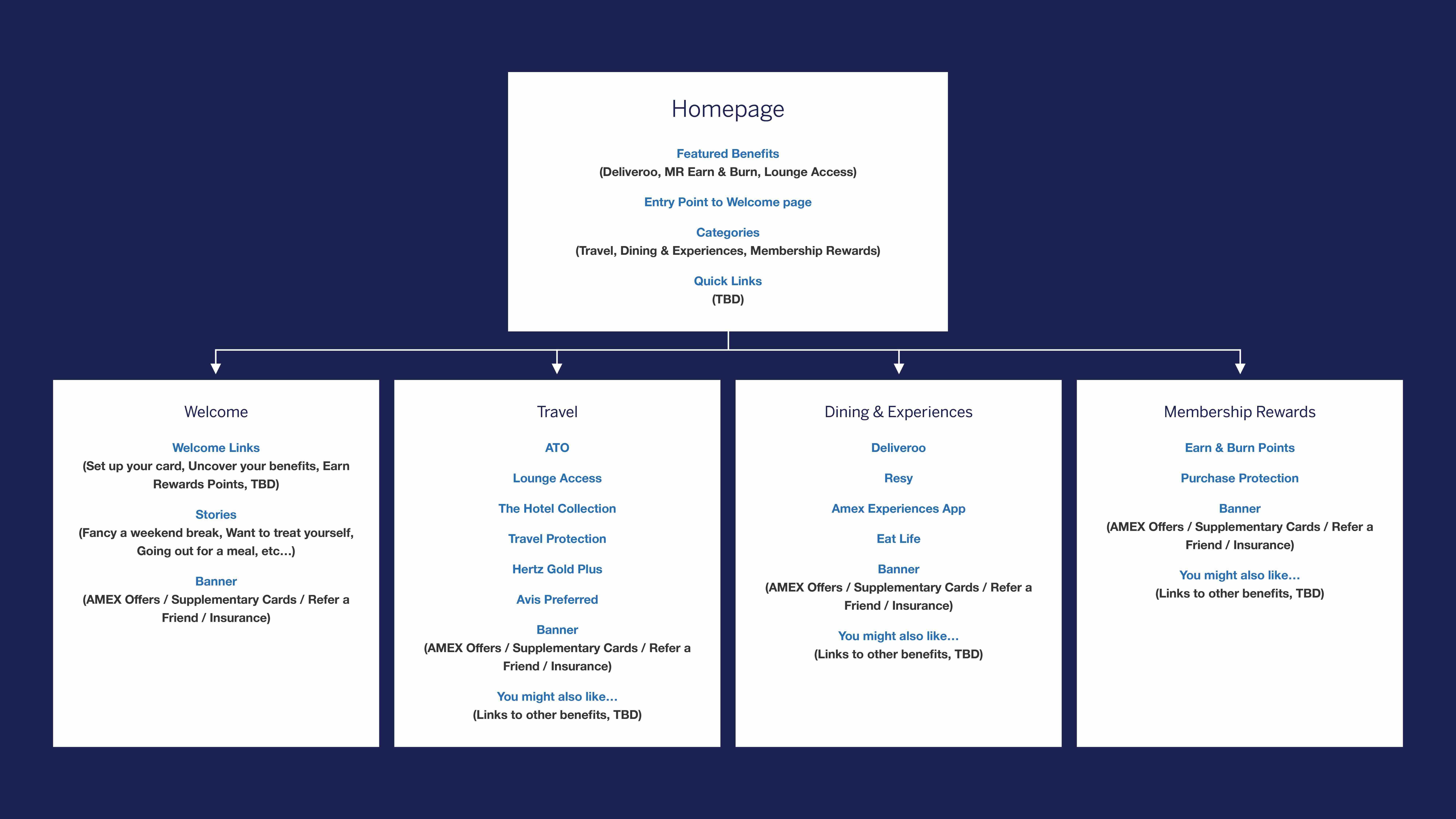
After evaluating each concept against user needs, feasibility, market potential, and scalability, we identified an IA diagram with a cohesive solution that works across various screens and user actions.
Technical Limitations
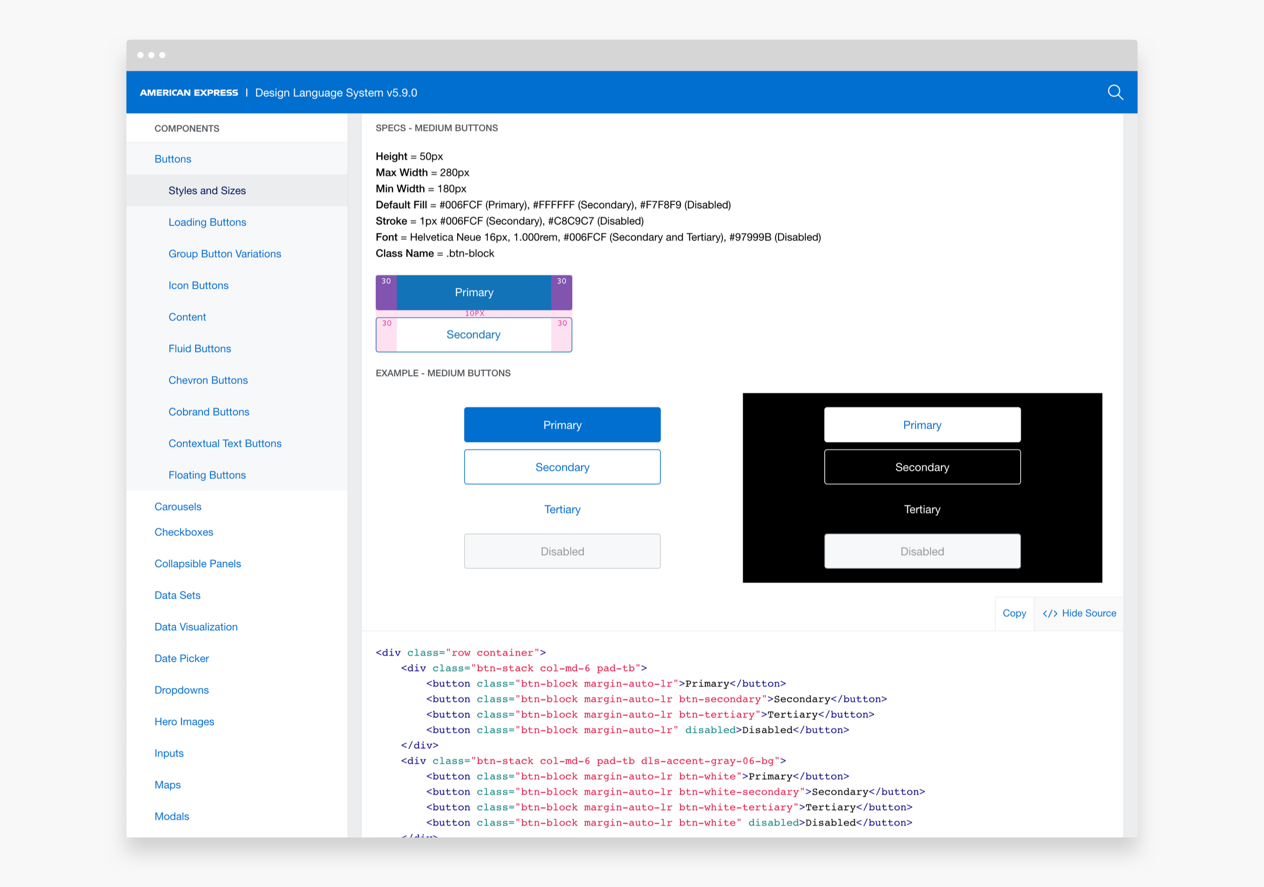
OneCMS is the proprietary content management system that American Express uses to build, edit, and launch pages very quickly without any developer or tech involvement. OneCMS is advantageous for clients, but its rigidity can limit UX/UI creativity.
Finite library of components
Interactivity is very simple and standard, so anything remotely dynamic, like a slider, quiz, exit pop-up, etc. would not be feasible for this page.
Restricted formatting options
Only AmexDLS fonts are available and some components restrict text formatting (no bold, underline, superscript, resize, etc.).
Almost completely responsive
Mobile optimizations are limited to reverse column stacking order or keep two columns (instead of stack) for some grids and hide image.
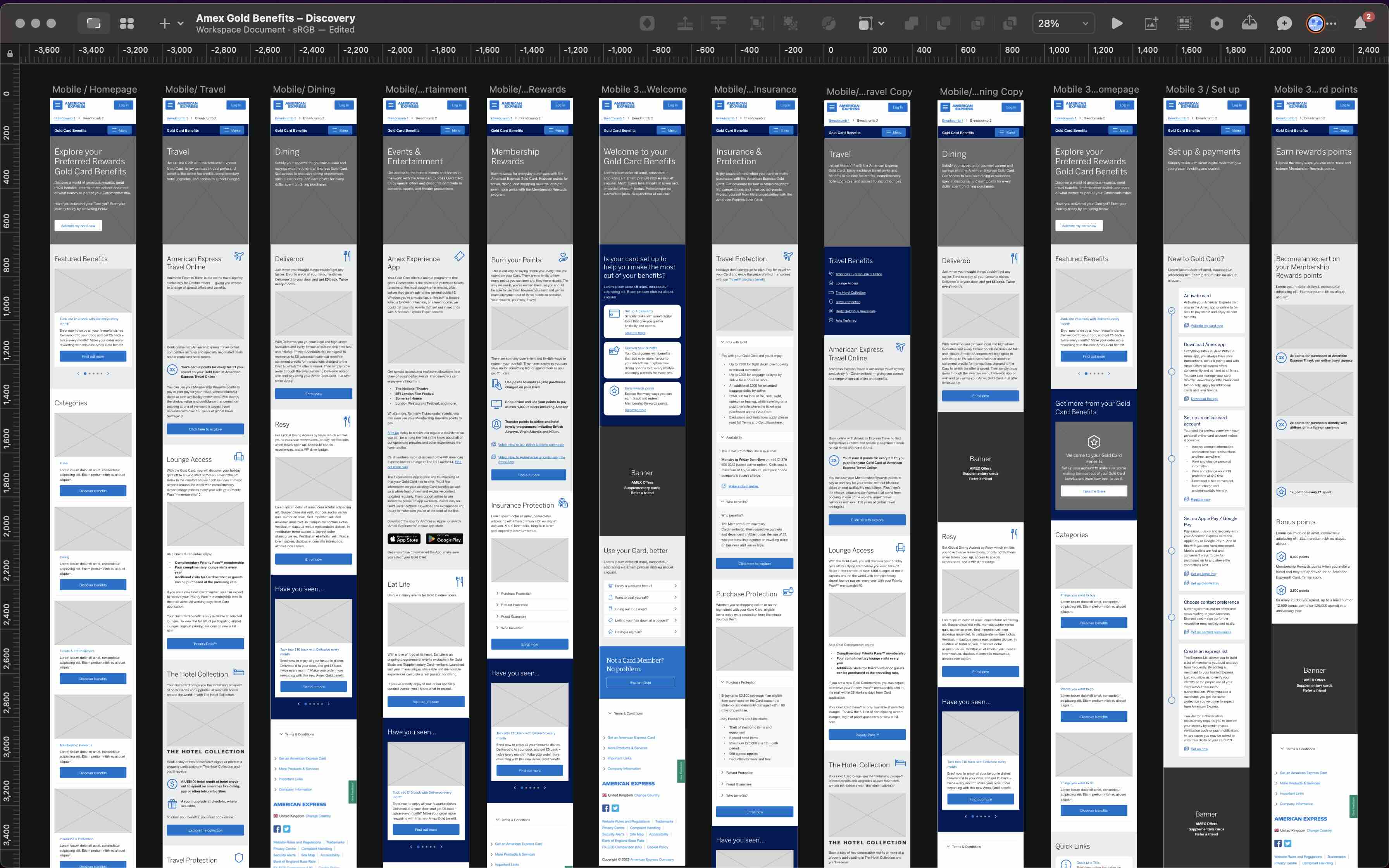
Early Wireframes
It became clear that including all the card benefits referenced in the campaign strategy would make the page too dense and therefore, ineffective. Cutting copy and collapsing modules became essential for scanability.
Detailed wireframes were made based on product user stories. Edge and corner cases were explored where possible. Everything was tested, iterated upon, and tested again over many cycles.
The Prototype
To help reduce the friction in the navigation flow, we broke down the processes into logical steps to make it easier to understand and less painful for the user.
In formal test sessions and impromptu guerilla testing, we checked assumptions and iterated on things that weren't working. The user testing was a success, with all participants being able to successfully navigate and comprehend the card benefits.
Test the Protype here→
Refined Design Patterns with Photography and Typography.
I communicated directly with the Digital Experience team dedicated to the American Express Brand Library. They guided me to the photography databases and UI component library associated with the American Expresss website. This insight helped me understand the existing guidelines and how we could innovate while remaining on-brand to enhance the Amex Gold Experience.
A final solution was improved and prototyped for delivery
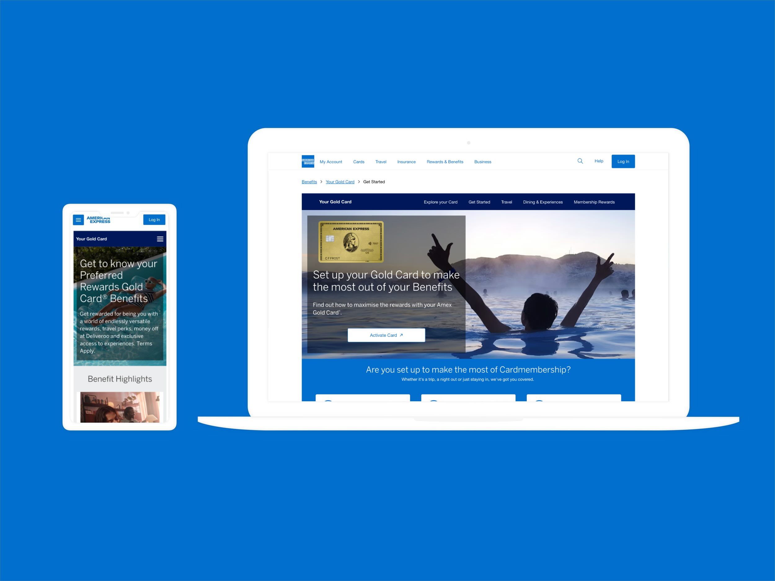
Alongside the final onboarding journey solution of a prototype, key screens were redesigned for the American Express Gold card across mobile, tablet, and desktop platforms.
Following the success of the Gold experience, the design approach was also adopted for the Platinum Card experience. I collaborated closely with the team to ensure visual and functional consistency between the two journeys, maintaining a cohesive user experience across both tiers.